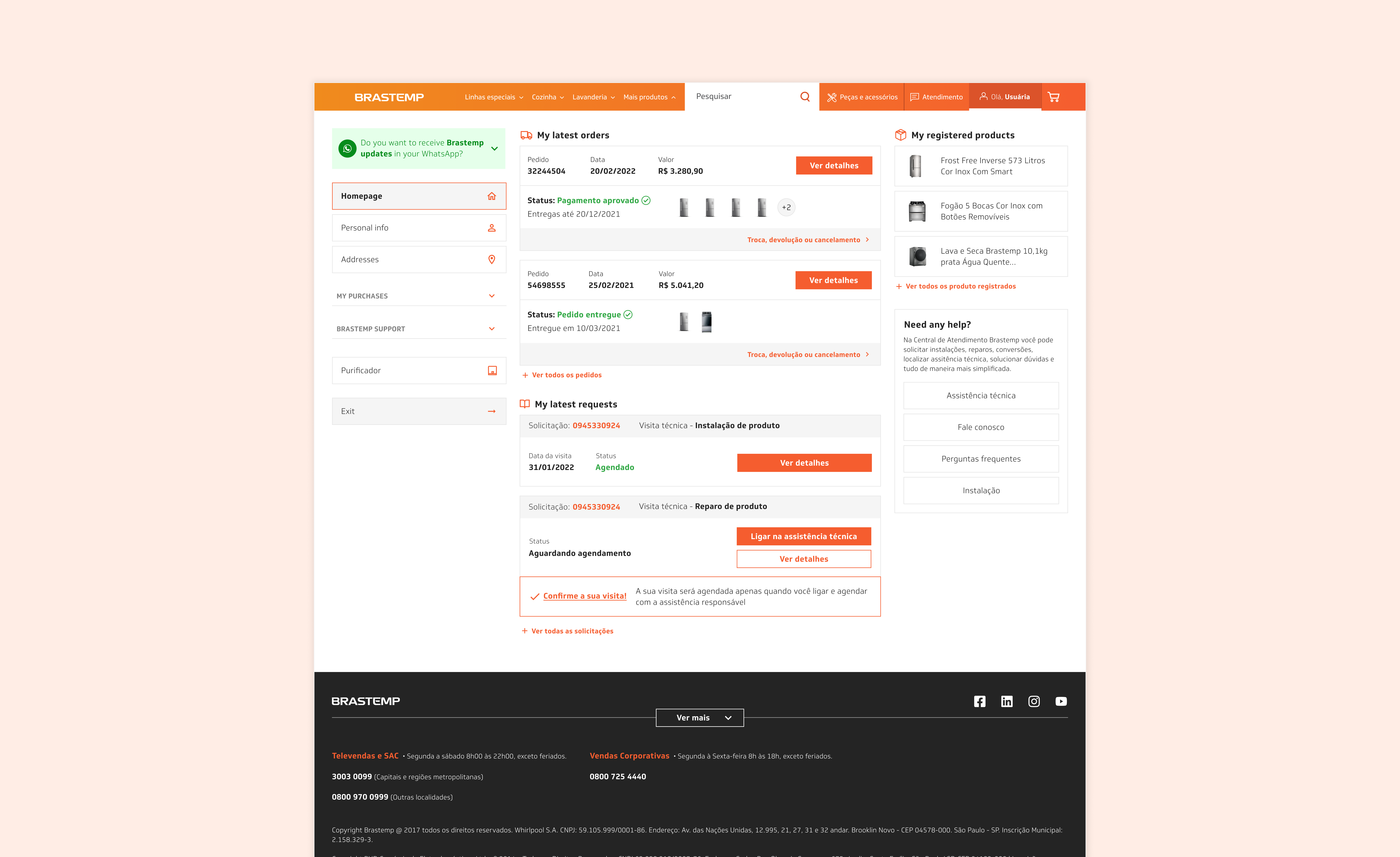
My Account page's new look
My role Product Designer
Timeline July 2021 - January 2022
Brastemp is a Latin American brand under Whirlpool Corporation and one of the biggest and most traditional household appliances manufacturers in Brazil. Whirlpool has been investing in their brands' ecommerce in the last couple of years, mainly during and after the pandemics.
The My Account team was composed of a PM, a PO and an Agile coach. In the Upstream there were 2 Product Designers (here I was 👋🏼) and a CRO analyst. In the Downstream there were a Tech Lead, 2 Devs and a QA analyst. The team's scope was to provide a seamless digital experience for all consumers who purchase Brastemp appliances on its website, as well as handy information, services and support for their products.
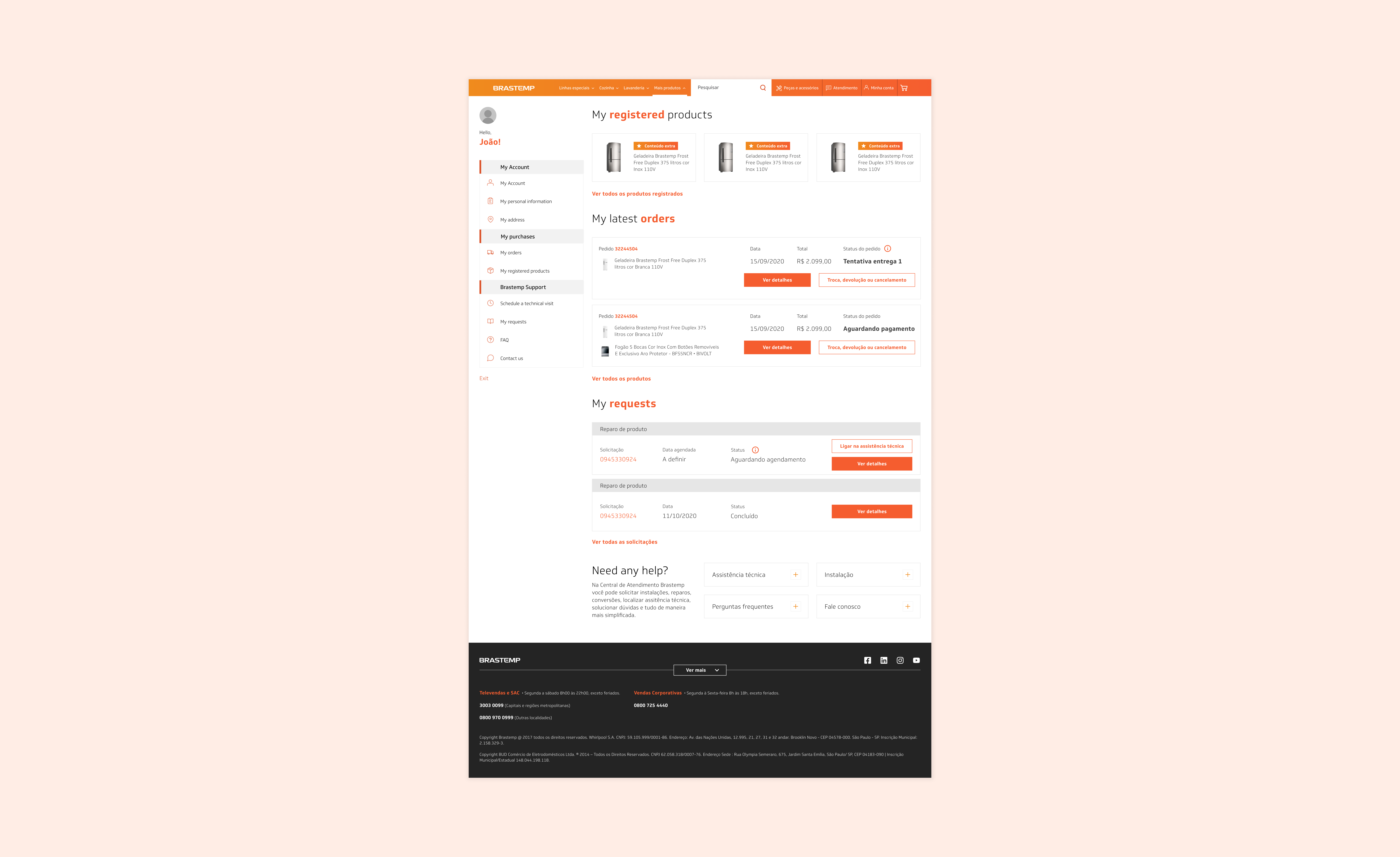
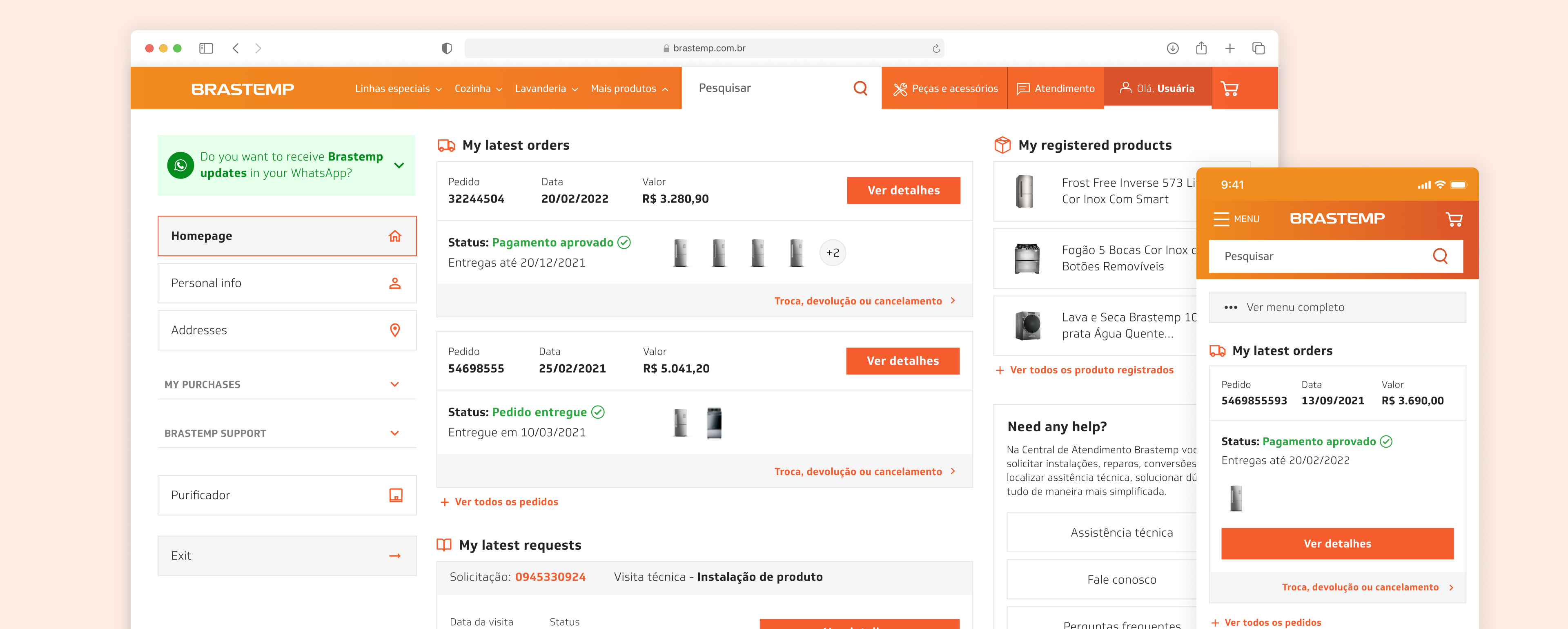
Brastemp's former My Account page
Throughout my time in My Account team, the biggest goal was to facilitate the access to post-purchase information, such as estimated delivery date, shipping status, order tracking and extended warranties. In order to understand which were the users' main pain points in their logged-in area, we ran a Hotjar survey to collect their impressions of it. We found out that the users' most frequent complaints were related to be unable to easily find order tracking information, such as delivery date and status.
90%
of users enters in their account page just to check the shipping status of their products
75%
wanted more detailed information about their orders and shipping tracking
52%
didn't find what they were looking for in the My Account environment
30,3
is the SUS score of My Account homepage. The average score is 68.
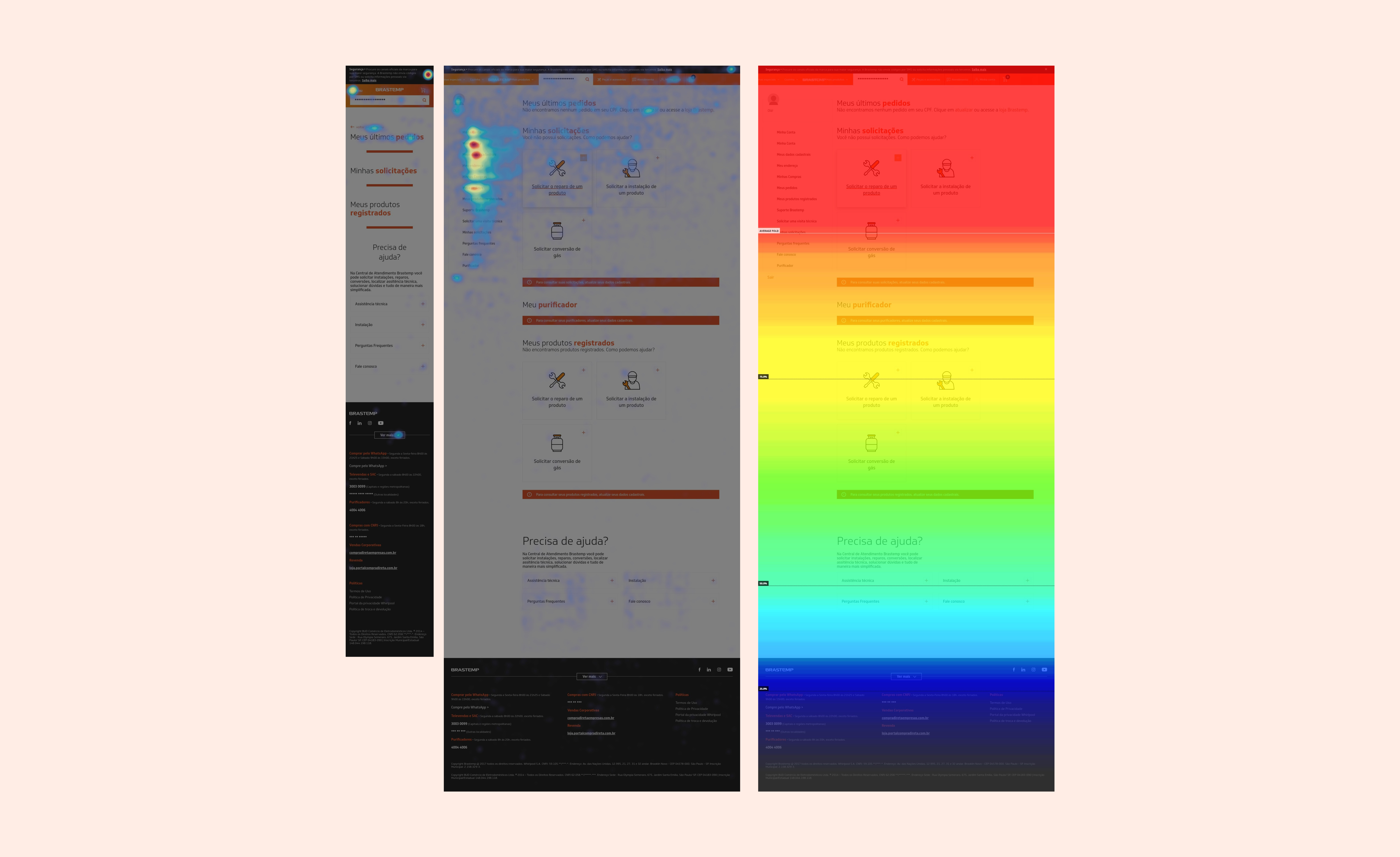
My Account page heatmap
Hypothesis
If we improve My Account's page information architecture and hierarchy, we could offer more findability and clarity to users, so they can spot easily what they're looking for.
After my Product Designer colleague and I defined a hypothesis to go ahead, I started prototyping the new My Account homepage. The focal point was to improve the page's information architecture, since it wasn't very suitable for what users wanted to visualize in their accounts. I also rearranged the sections in order to put the most accessed ones on the first fold of the page. Decreasing the page-height was an important goal as well, so I redesigned some components to use the space in a more appropriate way.
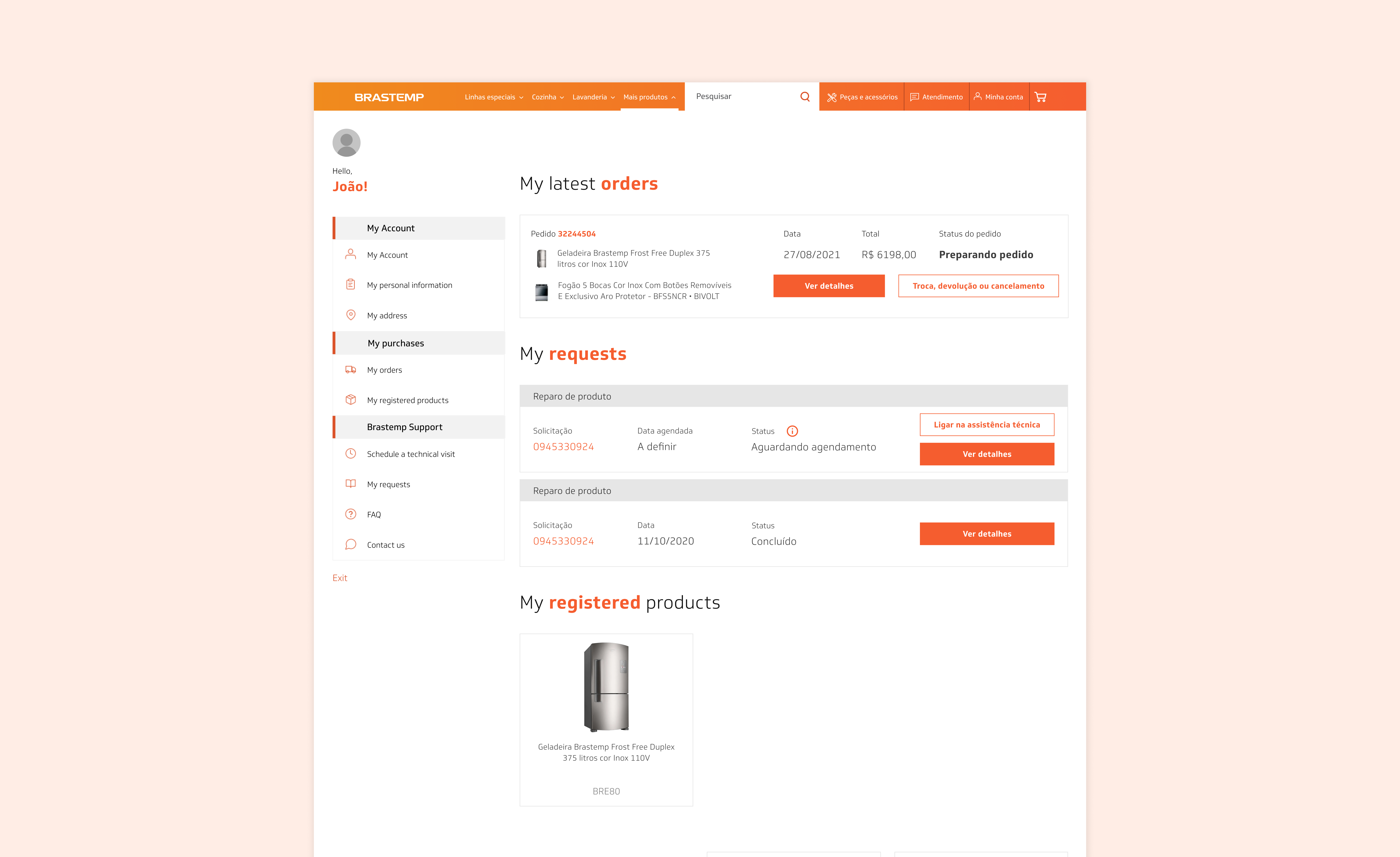
Former homepage vs. new homepage
(horizontally drag the handlebar)
Video of former homepage vs. new homepage
To validate if the redesign was successful, successful metrics were defined and should be analyzed after the new page is realesed.
1.
Check if the findability rate has increased through new Hotjar survey
2.
Verify if the time spent in users' account has reduced
3.
Enhance SUS score of My Account homepage
However, during the delivery process, the company decided to discontinue the My Account team because of strategic decisions and all the team members needed to be reallocated, including me. Nevertheless, the end-to-end process of improving the users' account homepage was very interesting and I was hopeful that users would much appreciate the revamp of this page.
© João Menezes 2025. Built with Semplice.